Design for the First Week of Homelessness
Background
Design for the homeless is a not-for-profit program that enables designers across all disciplines to volunteer their skills and creativity towards designing innovative solutions that will help the homeless population have better days and nights until they have homes of their own.
My Role: UX/UI Designer
The Outcomes
We provided initial concepts, design framework, and branding to realize a tangible product.
The Ask
Provide a digital product that could serve individuals experiencing homelessness, with emphasis on the first week of homelessness.
Phase Four Project Context
This project was broken up into four phases with groups comprised of multiple design roles across various locations. Prior to our group starting, work had been done to understand context (identifying causes and consequences of homelessness), the people, and their experiences (the complexities and main difficulties) while being homeless.
The goal for phase 4 was to explore a digital product that could serve individuals experiencing homelessness, with emphasis on the first week of homelessness. We met remotely via weekly calls and through mind mapping, we documented action items and insights in preparation for an in-person, brainstorm session.


Main Insights

According to the Chicago Coalition of the Homeless, Over 80,000 people are considered homeless.
Those who experience homelessness can include, unaccompanied youth, veterans, families and single parent families. Causes of homelessness include domestic violence, low minimum wage or job loss, limited affordable housing, high rates of trauma exposure or mental health, and generational patterns.
Homeless is deeply rooted in a lack of government aid and the inability to solve the core issues that cause homelessness. This includes a failure to provide adequate housing/shelter resources and proper access to protective resources (such as cash aid, health insurance, job training, etc).

Over 90% of people experiencing homelessness still had access to a cell phone.
The six main areas of concern include shelter, information/communication, government assistance, sanitation and hygiene, and food.
Existing Initiatives
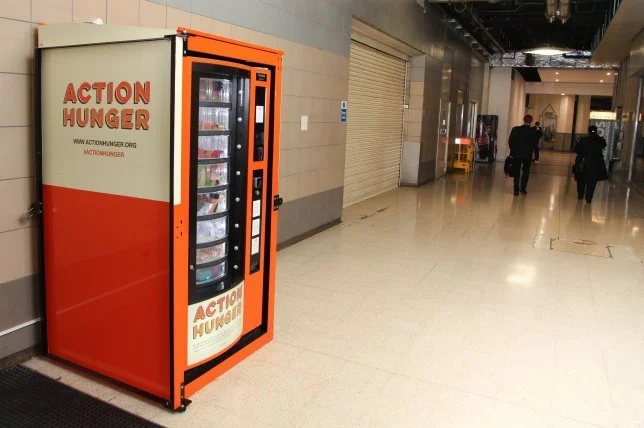
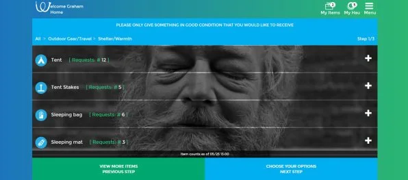
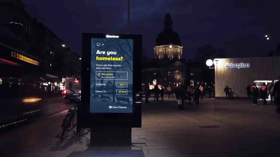
The main initiatives that spoke to me include repurposed vending machines that offer food and other necessities to any person given a card by a local shelter, a sharing economy app that matches the needs of homeless people with residents who have something to give, and digital kiosks repurposed to offer homeless people directions to the nearest shelter.
The Opportunites
An emphasis on placement and visibility
Shared community involvement
Repurposing of existing resources and materials
Accountability via systems of checkins and goal setting.
The Considerations
The possible lack of accessibility (both in terms of functionality and access)
Safety for all parties
Resource maintenance
Discrimination, bias and stigmatization
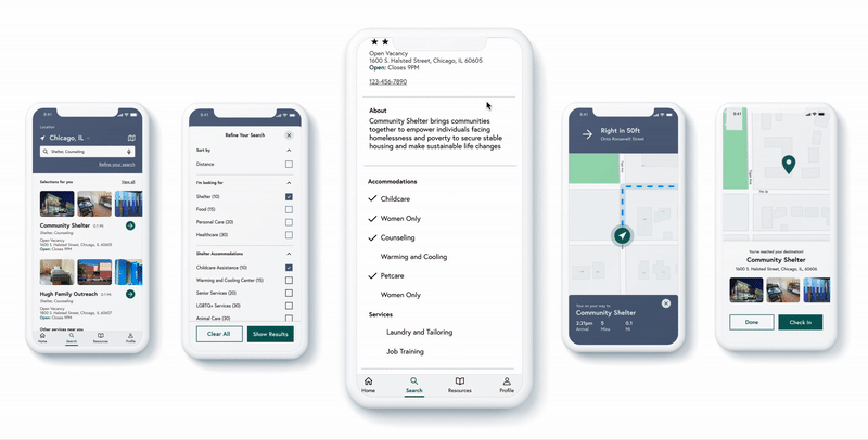
Concept A: Responsive Mobile App
“The Hope Network”
Our final proposal was for a responsive mobile app that houses a network that includes collaborating organizations (nonprofits, shelters, etc), individuals experiencing homelessness, and community organizations wanting to volunteer time, resources, and services.
In the beginning, we gravitated towards a kiosk option that would leverage current resources the city may have. These kiosks could be available at a variety of public places such as libraries and near public transit. We moved away from this option to a responsive app because there were concerns around stigmatization, privacy, and security.
Given the insights gained during the first few phases of research, we knew that over 90% of people experiencing homelessness still had access to a cellphone. So, we pivoted to concentrate on a responsive app that could scale to something like a kiosk once those challenges were properly addressed in the future.


On-Boarding (Introduction and Profile Building)
Allowing the person to find resources based on their specific interests in the initial onboarding
Find Nearby Available Resources and Get Directions
Find and view resources, accommodations, and services they need with in app navigation
Accessibility Annotations:
While not shown in the concept above, a link to view only text based directions should be provided while getting directions to their destination.
The map itself should be treated like an image or video with descriptive alternative text.
Account and Discovery (Home) Pages
They can receive community updates including free and open services/resources.
Accounting for Accessibility
While this app is only a concept that hasn’t been developed, tested or reviewed my someone with an disability (yet), I’ve made some design considerations and background research on accessibility best practices to ensure that this app is designed with inclusivity in mind. These include (but aren’t limited to):
Iconography is supported by labels to ensure recognition and understanding.
In order to not have color as the only means of conveying information, the bottom navigation has a selected state that includes appropriate color contrast (WCAG level AA) and a change in the font styling (bold) to give emphasis to the menu option that’s currently displayed on the screen. In addition to this, we could also include a change in the background color for an added layer of identification.
Gestures: While complex gestures may be an issues for those who may have dexterity issues, there may be some solutions. Those includes adding auditory instructions that programmatically announce the “swipe up” indicator as a button that’s activated through double tap.
Learnings
I cant stress enough that this is an approach, not a solve for deep-rooted, systemic, infrastructure-based problems that cause people to become homeless.
I entertained a preferences/profile builder during the on-boarding process and other ideas pertaining to personalization. To my knowledge, none of the volunteers on the phase 4 team expressed that they’ve experienced homelessness. So, I would highly encourage user testing with someone who has experienced homelessness during the next phase of this project. It’s important to ensure that the person using this service feels comfortable and that their privacy is respected. Additionally, given the immediacy of finding available resources, this profile based on-boarding may not be necessary at this time. I’ve accounted for this in the concept by adding a “skip” option.
This was an opportunity to collaborate with like-minded folks with different roles and levels while working remotely (before that was a thing). It was a lesson in overcoming the challenges of a revolving door that usually comes with anything volunteer led, and learning to pivot quickly based on feedback while balancing the ideas of a group.
For more information on this project and to view the final phase four deliverables, please view the presentation deck.